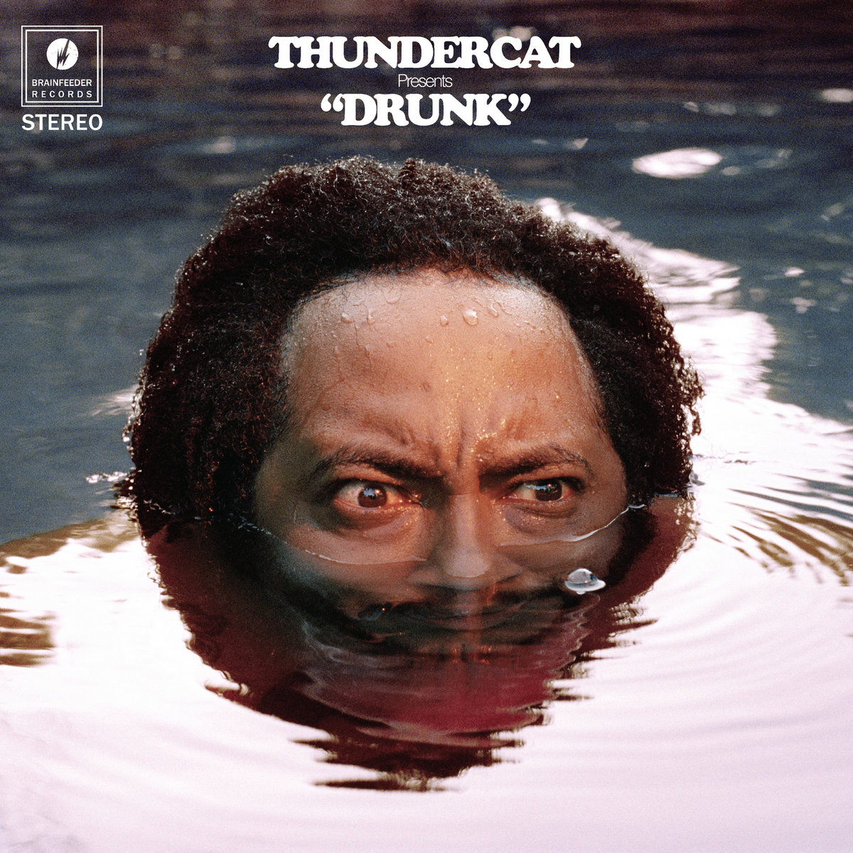
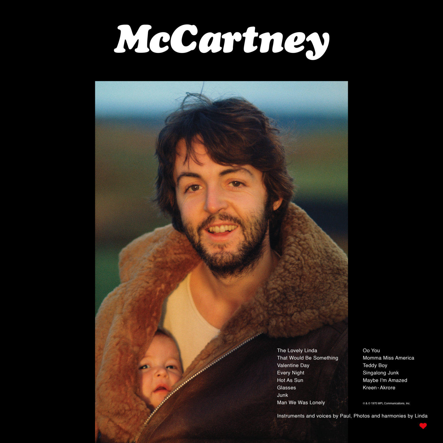
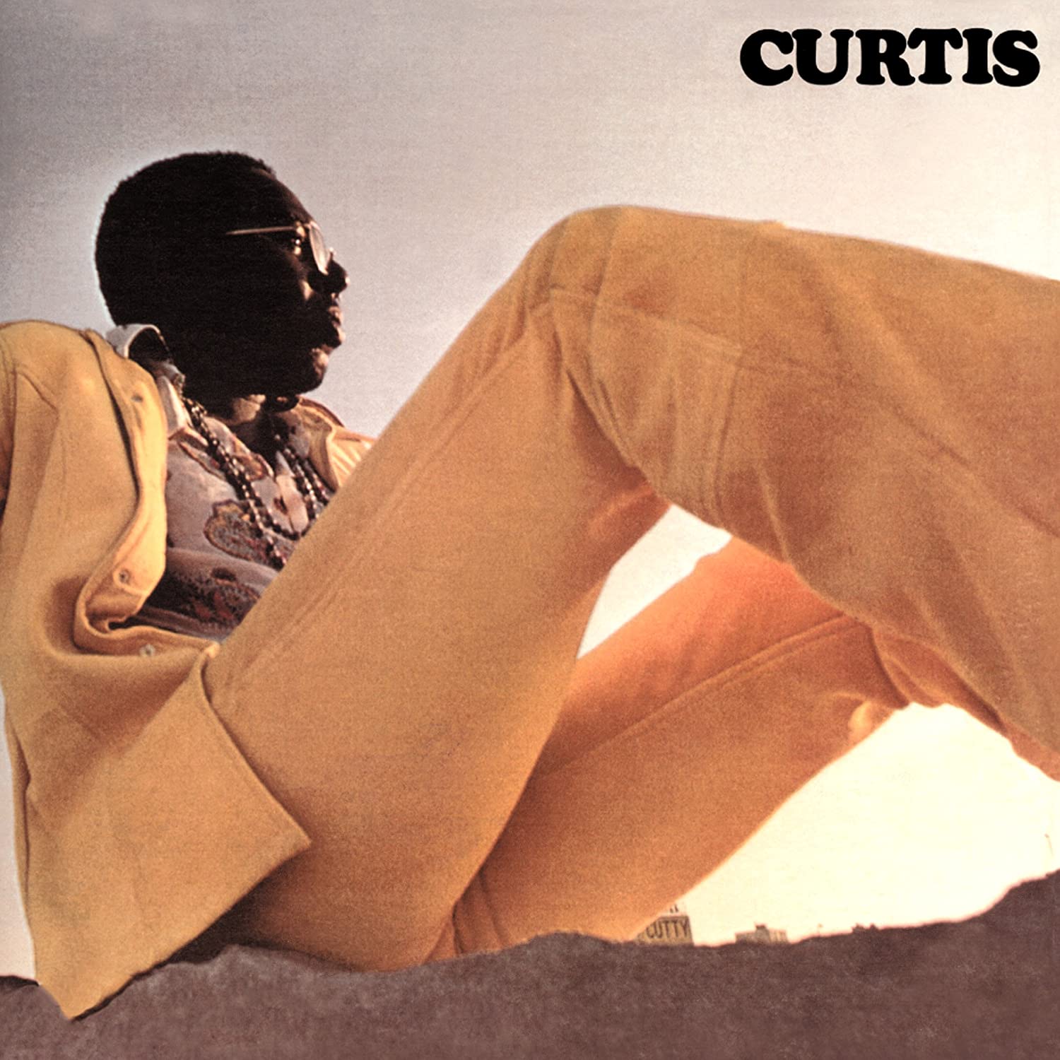
Cooper Black is one of graphic design’s unsung heroes. This typeface is hidden in plain sight in all corners of the world. Though it’s intended use was for headings it’s popularity is largely due to how it does not feel out of place on a wide range of mediums from print, ramen packaging, to EasyJet’s branding and has also been used as body text. Unlike most typefaces, Cooper Black does not have a flat base which means that type can be set in an irregular manner and still retain legibility while not being tied to the baseline. This spirit of non-conformity from the typeface is definitely carried onto to the album covers selected. We look forward to revisiting more uses of this amazing typeface in the future and don’t forget to let us know your favourite uses of Cooper Black either on album covers or (anywhere else).